Redesigned Claim and Verification Flow
| Outcome | 8-point uplift in business verification rates post-launch (61% to 69%) |
| My role | Lead Researcher |
| Team | Partner Platform, Tripadvisor |
| Methods | Moderated usability testing |
| Participants | 9 business owners and representatives across 8 countries |
| Timeline | Dec 2023 to Jan 2024 |
The situation
Tripadvisor's Partner Platform team supported hoteliers and restaurateurs who manage their business listings on the platform. For these partners, the first step to managing their listing is claiming and verifying it. If that process breaks down, nothing else follows.
Past research had already identified the problem. Business owners found the process of creating, claiming, and verifying their listing confusing and frustrating. They often felt stuck. The flow lacked clear step-by-step instructions, and some partners struggled to even find the starting point. The team responded with a redesigned Claim and Verification flow, built to address the identified pain points, and it needed to be tested before launch.
The stakes were straightforward. More verified businesses means more active listings, more photos, and more review responses. A smoother verification process for business partners meant better content and engagement for travellers.
The research challenge
How easy is it to create, claim, and verify a business listing on Tripadvisor using the redesigned flow?
This was not a simple pass/fail evaluation. The research had a dual objective. First, assess whether the redesign had actually addressed the problems the earlier research had surfaced. Second, catch any new issues that could cause confusion or frustration before the flow went live. Fixing known problems is only useful if you do not introduce new ones.
The participant complexity added another layer. The research needed business owners and representatives who could engage with the full flow authentically, across diverse markets and business types. These are busy people running hotels and restaurants, not a panel of testers available on demand.
What I did and why
I ran nine moderated usability tests with five Restaurateurs and four Hoteliers using Great Question. Participants were the Owner, General Manager, or Marketing Manager of their business. They were based in eight countries across five continents: the USA, Portugal, Egypt, Uganda, Singapore, Thailand, Australia, and Indonesia.
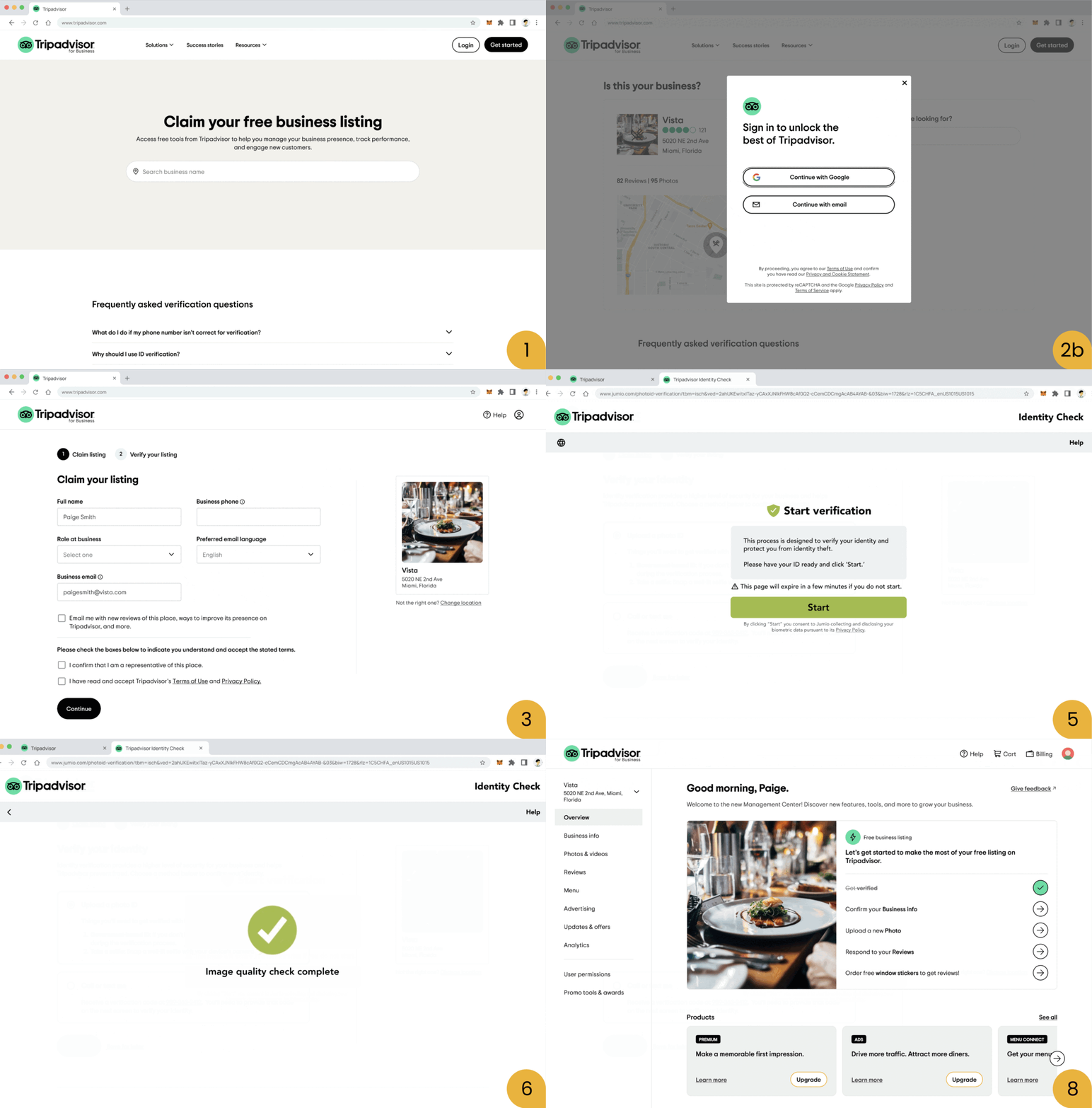
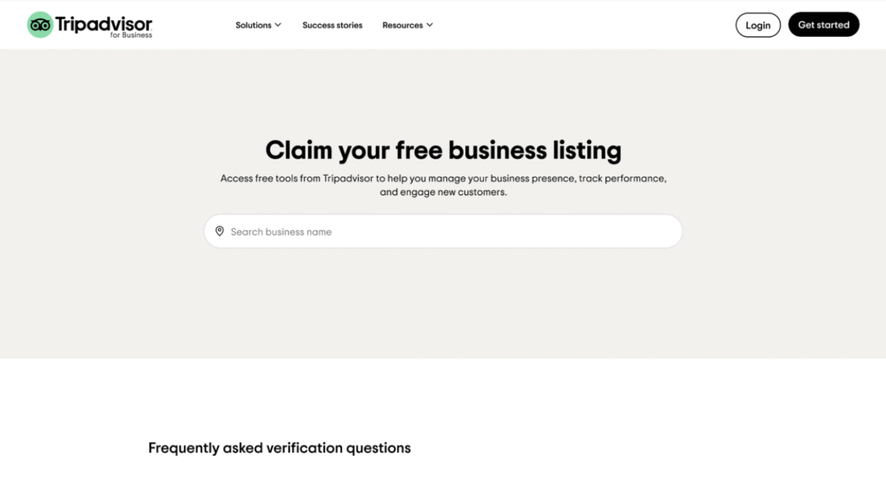
In each 30-minute session, participants tested a prototype of the redesigned flow using a scenario. They thought out loud as they went from the initial "Claim your free business listing" page through to the verification step and the post-claim Management Center checklist.
Moderated testing was the right method here. The flow involved decision points where partners had to choose between verification methods, provide sensitive information like phone numbers and government-issued IDs, and navigate pages where the branding shifted slightly due to a handoff to a third-party identity verification provider.
These moments produced emotional responses, hesitation, and trust concerns that I needed to probe in real time. The B2B context made this especially important. Business owners bring assumptions about how professional tools should work, and those assumptions needed to be surfaced and explored, not inferred from a recording. In an unmoderated test, I would have seen what participants did but missed why they paused, what made them uneasy, or what they misunderstood.
What we found
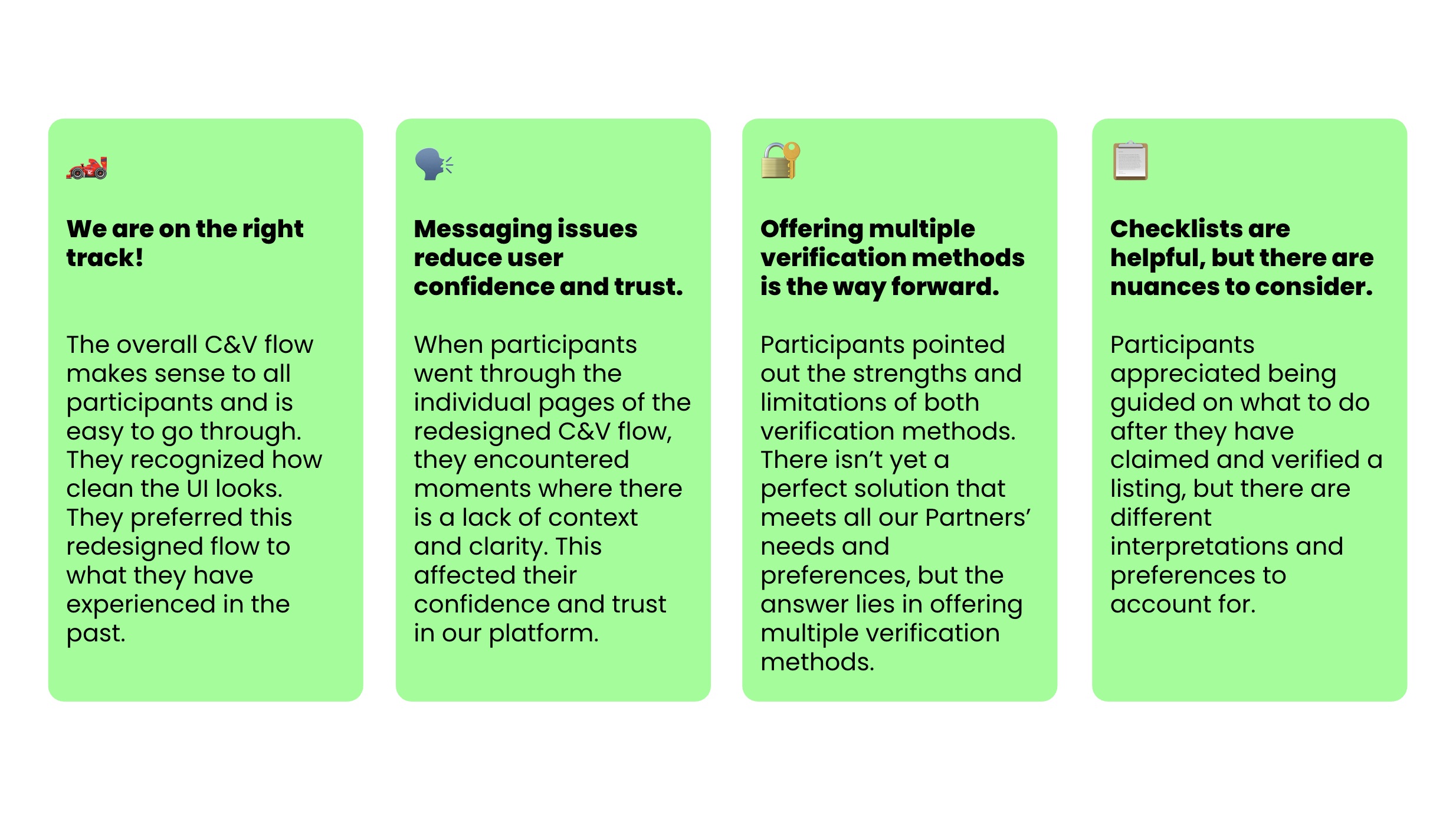
The redesigned flow worked. All participants found the overall Claim and Verification process logical and easy to go through. They recognised how clean the UI looked and preferred it to what Tripadvisor had before. The team was on the right track.
That said, as participants moved through the individual pages, they hit messaging issues that chipped away at their confidence and trust.
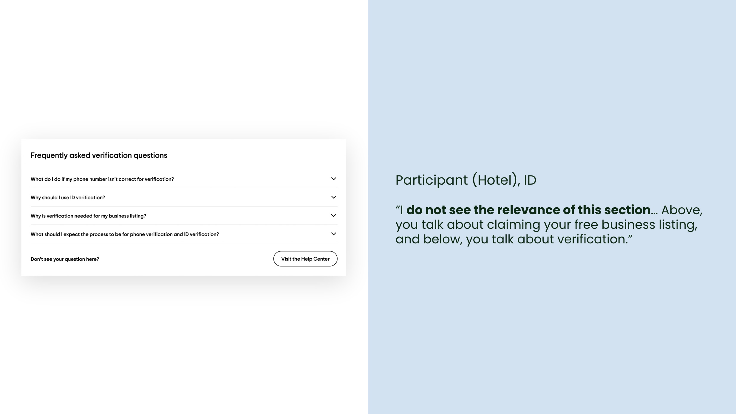
The problems showed up at specific points. The FAQ section appeared on pages where partners were still claiming their listing, but the questions were about verification. Partners said they would only look at FAQs if they hit a problem, and when they did, they expected the questions to match what they were doing on that page.
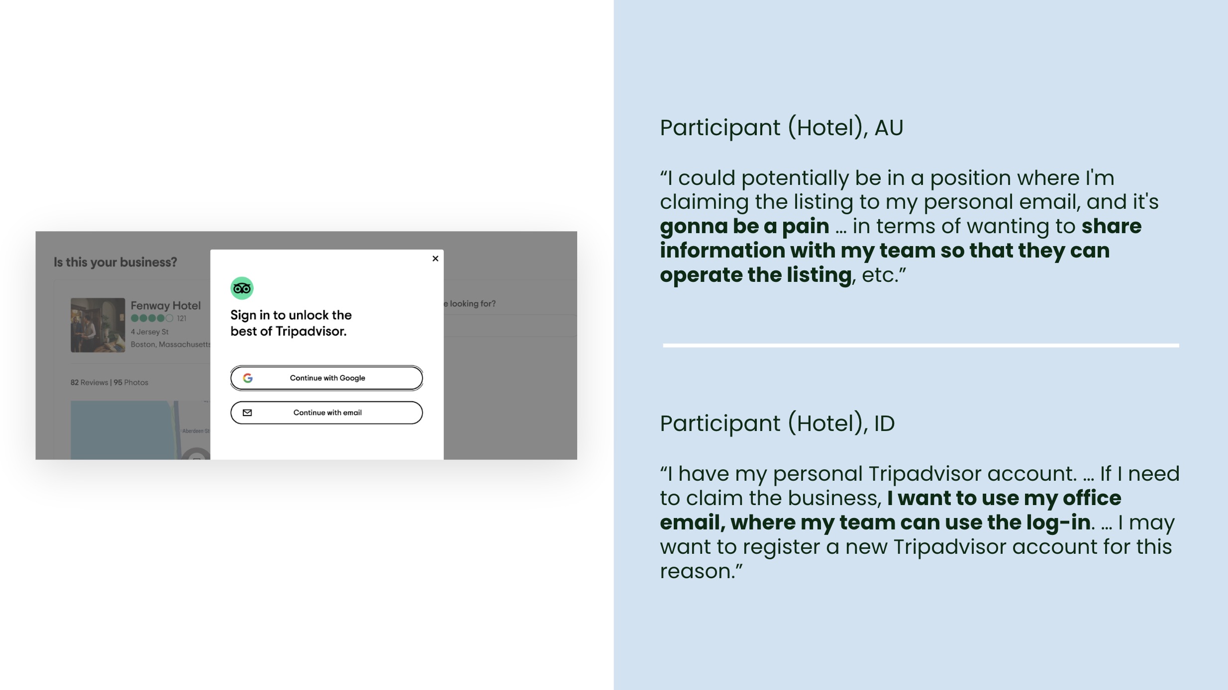
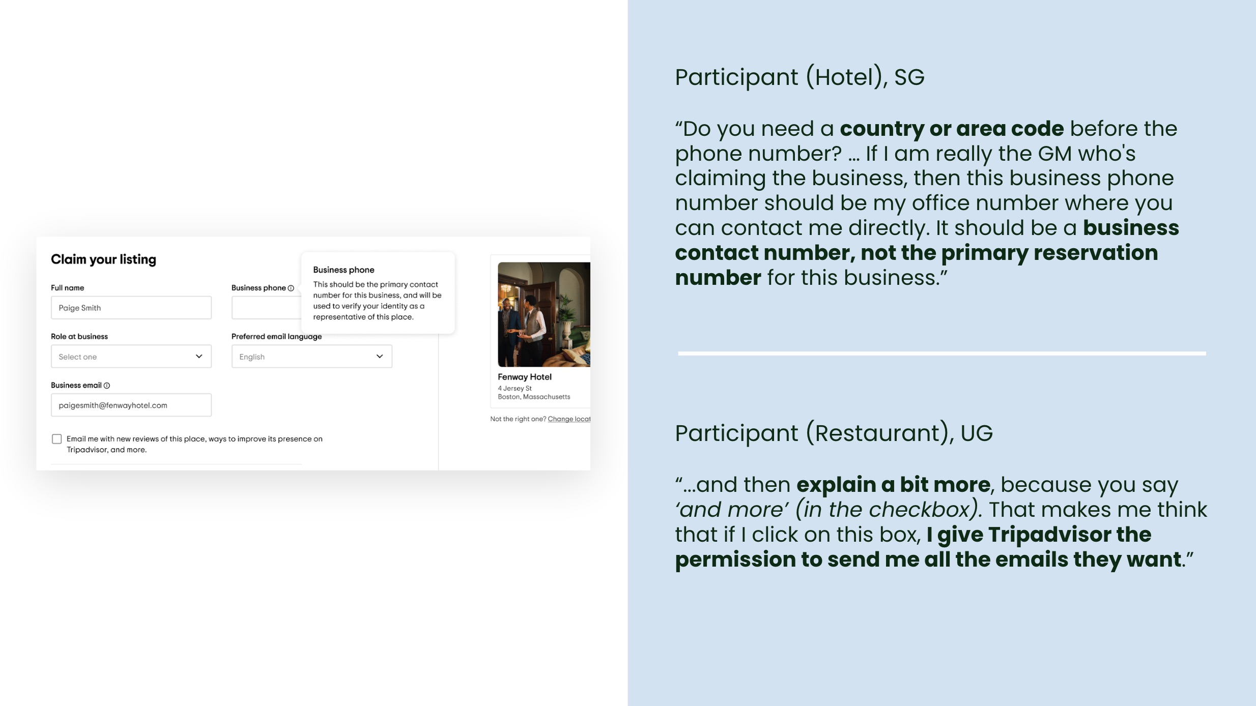
The sign-in modal did not prompt partners to use a business email address, so some assumed they should log in with a personal Tripadvisor account. Others were unclear if a country or area code was needed when adding a phone number and uncertain whether the number would be shown publicly. On the "Claim your listing" page, the email opt-in checkbox used language like "and more" that made some participants cautious about what they were consenting to.
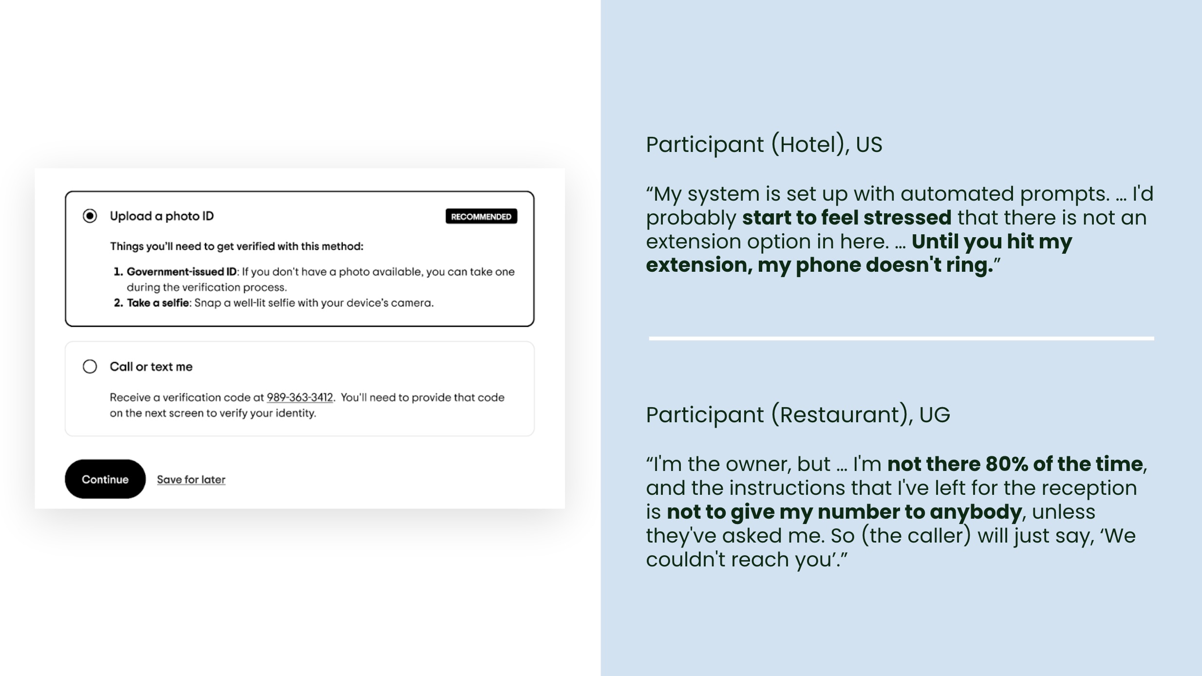
The verification step surfaced the sharpest tensions. The flow offered two methods: photo ID verification (marked as "recommended") and call or text verification. Most participants naturally preferred call or text, because it felt simpler and carried fewer privacy concerns. However, they were unsure whether they could actually be reached at their business number. Automated phone systems, extension numbers, and the fact that owners are not always on-site meant a call might go unanswered.
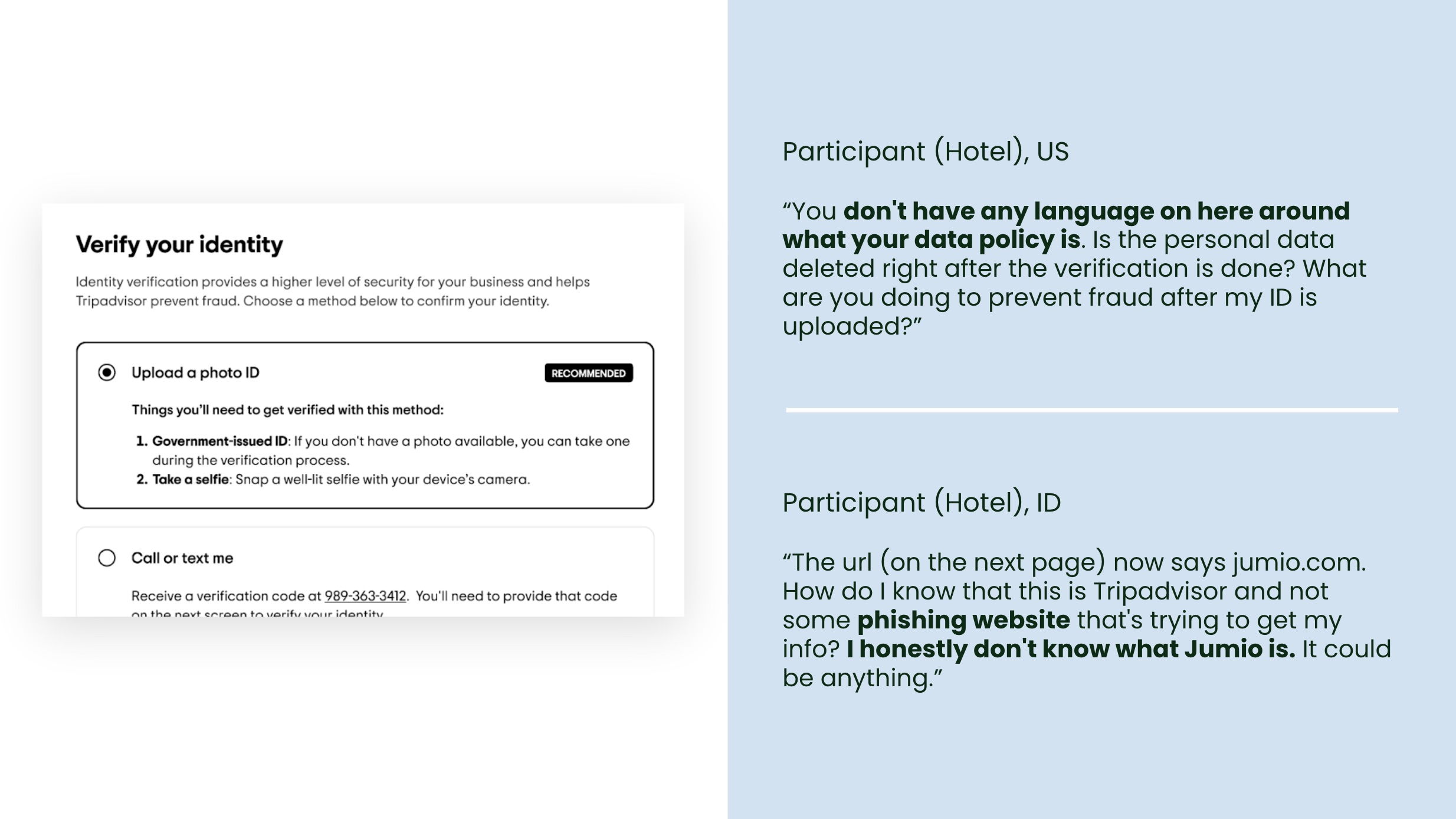
Lack of confidence when sharing personal details
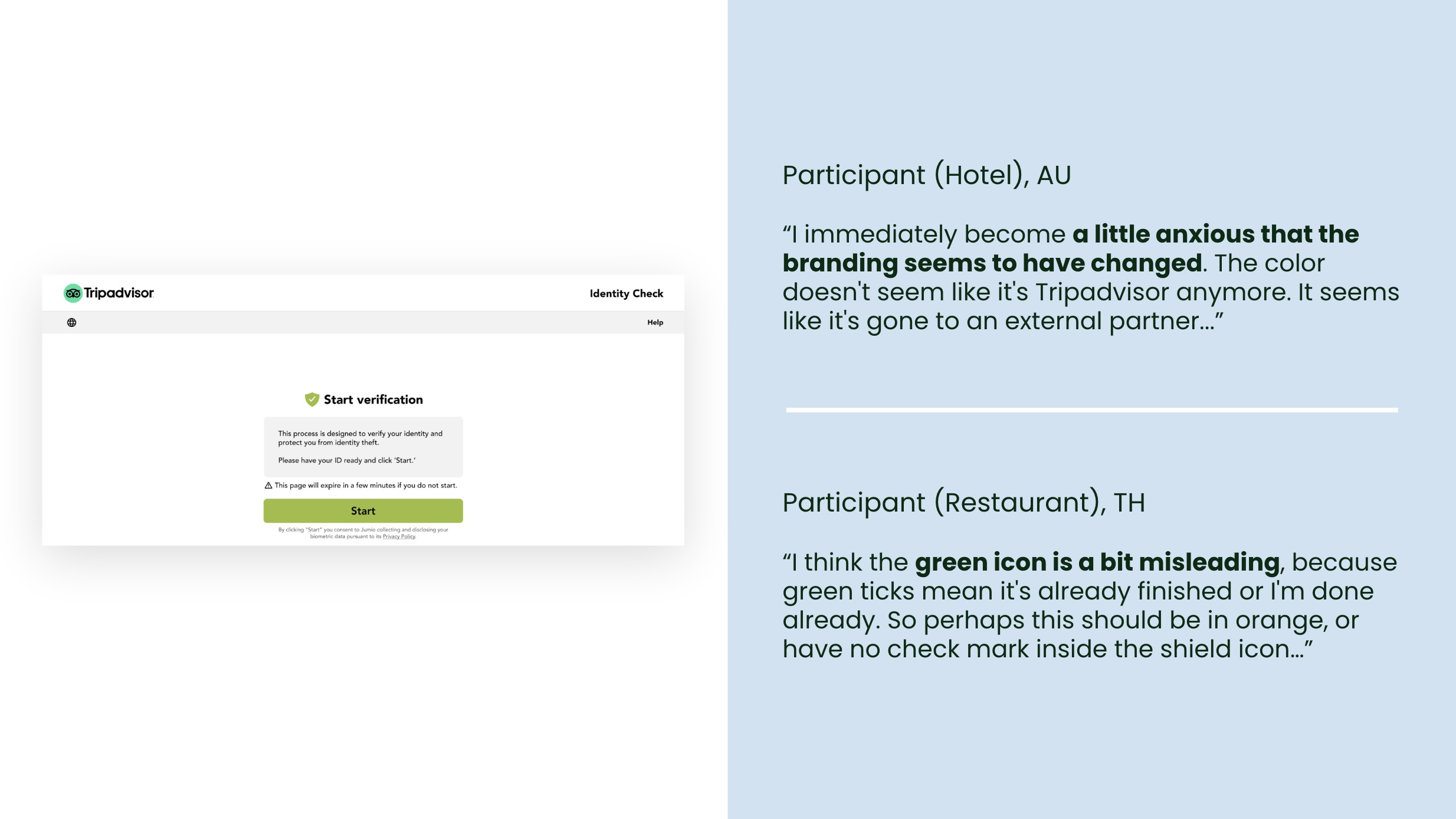
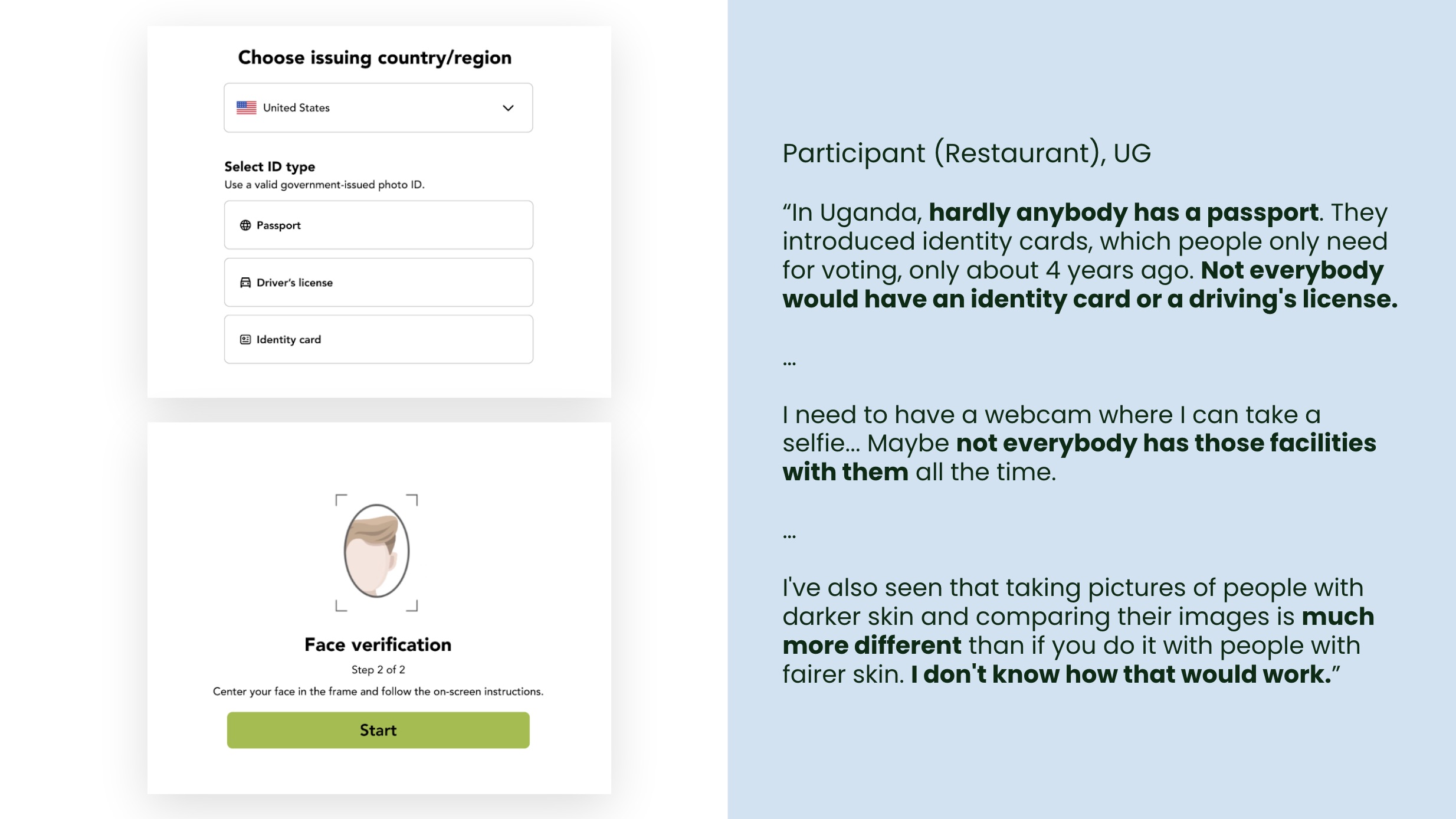
Photo ID verification, meanwhile, raised questions that the page did not answer. Participants did not understand why uploading a personal ID was recommended for a business process. Some were uncomfortable sharing confidential documents with a non-government platform. A participant in Uganda pointed out that not everyone in every country would have the accepted ID types, a webcam, or confidence that facial recognition would work reliably across skin tones. When the flow handed off to Jumio (the third-party identity verification provider), the branding and URL changed, while the green colour scheme shifted. Several participants said this made them anxious. One even described it as looking like a phishing site.
No single verification method met every partner's needs. But conversations with participants made it clear that having multiple options was the right approach. Some participants wanted even more, particularly email verification, which they saw as the most straightforward way to prove their connection to the business.
What changed
The research pointed to specific changes the team needed to make before launch. I shared UXR recommendations with the Designer and PM on the Partner Platform team. The recommendations addressed five areas:
Redesign the FAQ sections so the questions match what partners are actually trying to do on each page.
Add guidance at the sign-in step to prompt partners to use a business email address.
Clarify how phone numbers and email addresses would be used, and rewrite the email opt-in language to communicate direct benefits rather than vague promises.
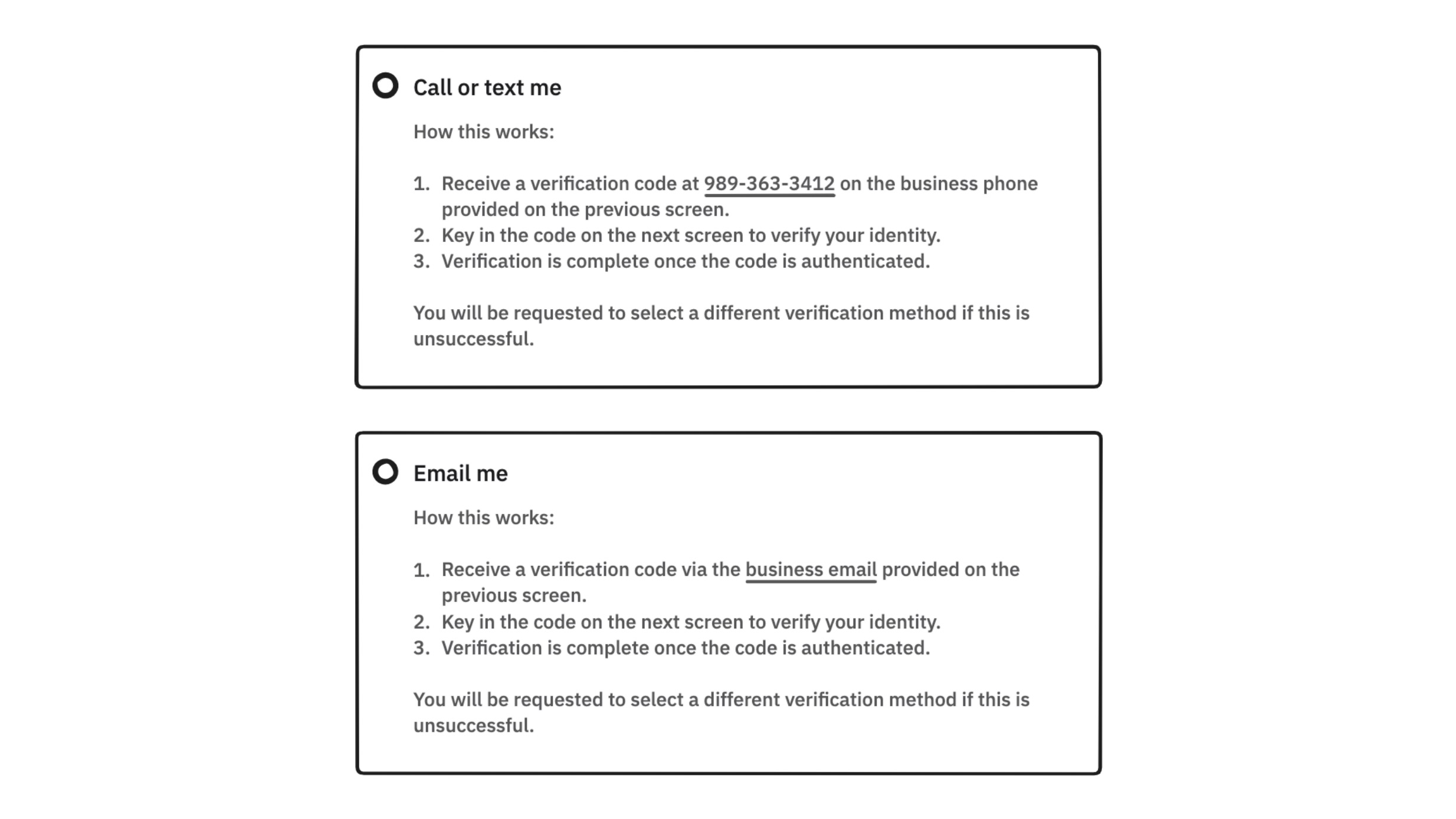
Redesign the verification method selection to explain how each method works, what to expect, and what happens if it is unsuccessful.
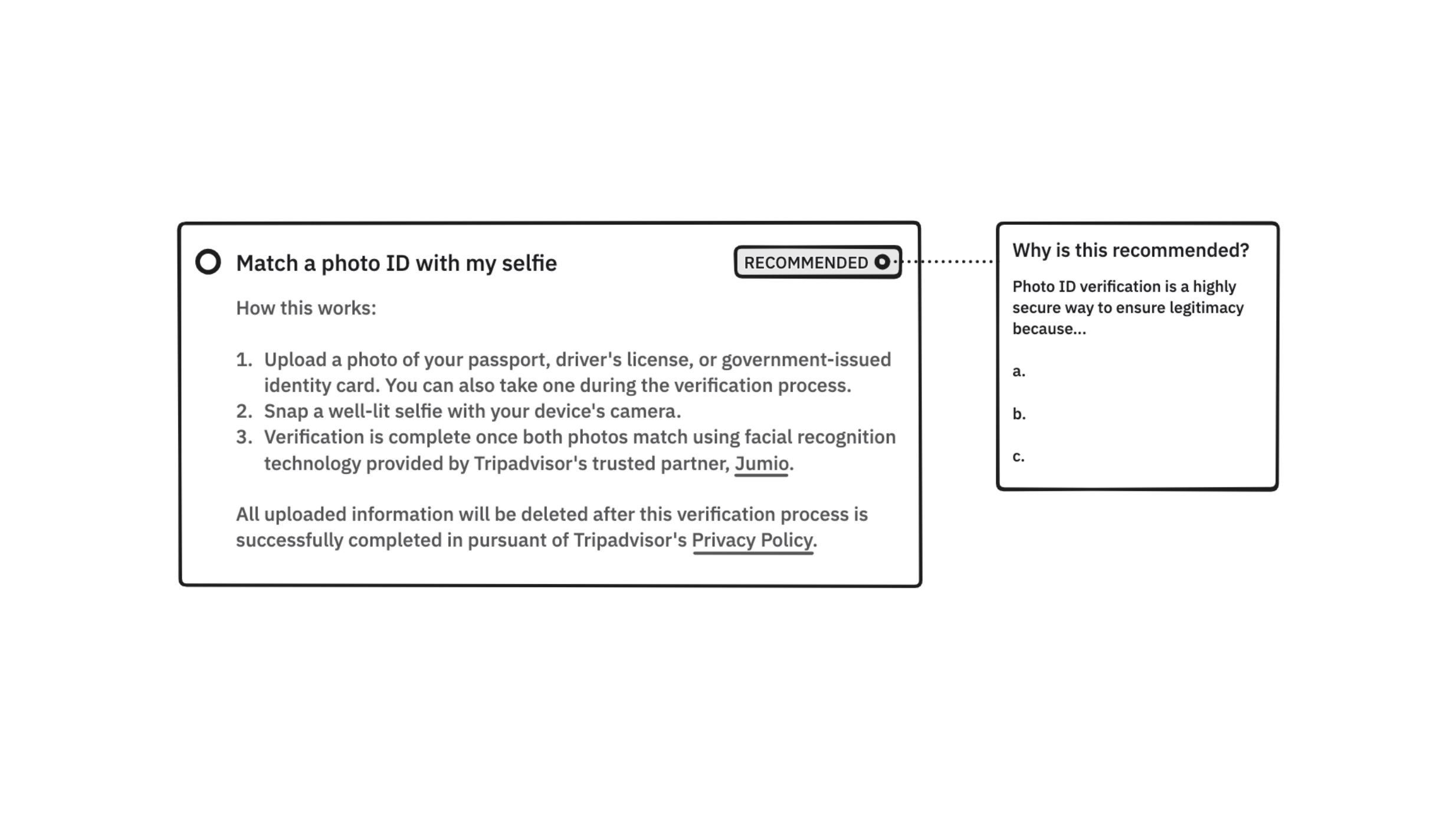
For the photo ID path, explain upfront who Jumio is, how it uses facial recognition, what ID types are accepted, and how uploaded information would be stored and deleted.
Wireframed recommendations
Delivering the report was the start of a different kind of work. I stayed involved through the final iterations before launch, working directly with the Designer and PM. In practice, that meant two things.
The first was iterating on copy together. The email opt-in checkbox had used language like "and more," which participants had interpreted as giving consent to irrelevant emails. We removed the ambiguity and made the benefit explicit: tips to improve their Tripadvisor for Business account.
For the photo ID verification path, we rewrote the explanation so that partners would know upfront that it requires a specific ID type, a camera device, and the involvement of Jumio and its facial recognition technology. In both cases, having heard the participants react to the original language meant I could push for wording that addressed the specific confusion, not just clean up the copy in the abstract.
The second was the Designer and PM bringing revised design options back to me for input. The FAQ redesign was a good example of how this worked. My original recommendation was to align the FAQ questions with the purpose of each page. The team implemented that fix and brought it back for review. As we looked at the result together, we realised that once the underlying messaging issues were addressed properly, several pages no longer needed a FAQ section at all. We cut the FAQs from the initial claiming pages, reduced visual clutter, and made sure that the FAQs that remained were relevant to the page they sat on. The final solution went further than the original recommendation because the collaboration gave it room to evolve.
The research also informed a parallel exploration of the post-verification checklist design and surfaced a separate opportunity to educate businesses about the value of becoming paid users through product cards and upsells. Both work streams sat outside the scope of the C&V redesign itself, and the decision to pursue them said something about how far the research had reached.
The outcome
Post-launch, the rate at which businesses got verified for a specific location increased by 8 percentage points, from 61% to 69%, compared to the old Claim and Verification flow.
More verified businesses meant more active listings, more photos, more review responses, and more engagement on the platform. The B2B metric had a direct B2C payoff: travellers get a better-maintained platform to make decisions on.
The paid product education work stream that emerged from the research said something about what the study had produced. It closed the question it was designed to answer. It also opened new territory for the team: how do you convert newly verified businesses into paid users?
Reflection
The metric matters, but the lesson drawn from this project is about what happened after the report was delivered. A research report can say "partners do not trust the Jumio handoff". Whether that concern is addressed in the final shipped product depends on whether someone carries it through implementation.
I stayed involved because I had heard participants describe the Jumio page as a potential phishing site. I had watched a business owner in Uganda explain why photo ID verification would not work in their country. Those details are easy to lose in a roadmap conversation, but being at the table meant they were not neglected.